Data visualization
There are multiple libraries for data visualisation in Python.
In this lecture we focus on the most widely used: matplotlib, together with seaborn, which is built on top of it.
Other libraries such as plotly, geopandas and Bokeh are useful for specific or interactive tasks.
matplotlib
matplotlib is a plotting library that produces figures in a variety of hardcopy formats and interactive environments.
It has many kinds of heavily customizable plots: line plots, bar plots, stacked bar plots, scatter plots, histograms and more.
matplotlib can handle categorical data, timestamps and other data types.
Import convention
Core plot functions are in the .pyplot subpackage that is conventionally imported as plt.
import matplotlib.pyplot as plt
Jupyter magic
IPython (Interactive Python, the shell that powers Jupyter kernels and offers support for interactive data visualization) provides magic commands that can be triggered with %.
From the docs:
With the following backend, the output of plotting commands is displayed inline within frontends like the Jupyter notebook, directly below the code cell that produced it.
The resulting plots will then also be stored in the notebook document.
%matplotlib inline
Anatomy of a figure
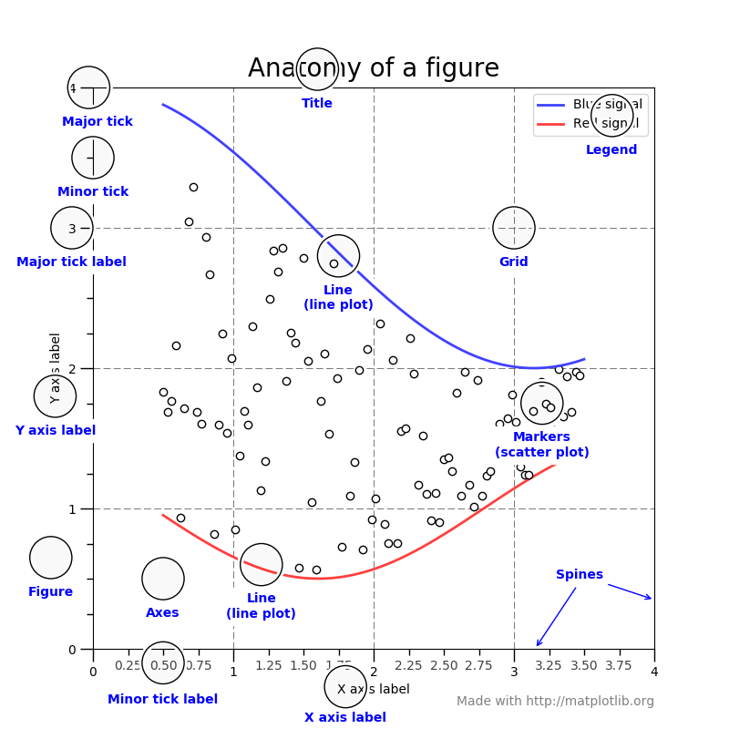
Let’s begin by inspecting the anatomy of a figure to better undestand the names of each element and what we are doing.
Each of these elements is called an Artist.
There are Artists for the axes, for the labels, for the plots, etc.
A Figure represents the figure as whole.
Axes is the region of the image with the data space. An Axes contains two (or three) Axis.
Axis objects are the axis of the figure.
plt.rcParams['figure.figsize'] = [6, 4]
plt.rcParams['figure.dpi'] = 150
Create a new figure
We can create a new figure with the .figure() method.
This step is not mandatory and, if you don’t instantiate a new figure, one will be created with the default parameters.
# an empty figure with no Axes
fig = plt.figure(figsize=(10,10), dpi=300)
<Figure size 3000x3000 with 0 Axes>
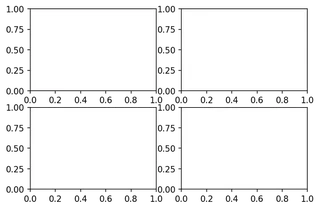
Figure with a single Axes
The .subplots() function creates, in a single call, a figure and a set of subplots.
You can provide the number of rows and columns in the plot.
# a figure with a single Axes
fig, ax = plt.subplots()

# a figure with a 2x2 grid of Axes
fig, axs = plt.subplots(2, 2)
Plotting examples
After getting familiar with the names and with figure creation, let’s move to the actual plotting.
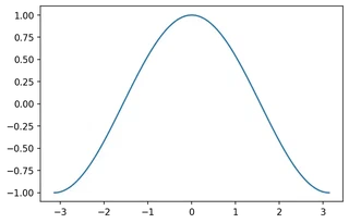
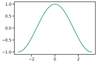
import numpy as np

X = np.linspace(-np.pi, np.pi, 128)
C = np.cos(X)

fig, ax = plt.subplots()
ax.plot(X, C)
[<matplotlib.lines.Line2D at 0x7f9d99f4d9b0>]
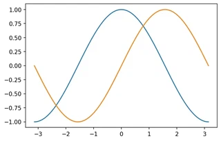
Multiple plots on the same Axes
How can we add a second plot with the sin function?
We just plot on the same Axes multiple times.
S = np.sin(X)

ax.plot(X, S)

display(fig)
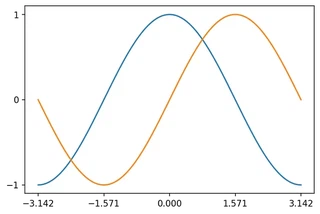
Setting the ticks
Ticks are placed automatically and the default placement usually works well.
If you need custom tick placement you can either:
- set explicit tick values, e.g.
ax.xaxis.set_ticks([...]), or - install a
Locatorobject to define rules for tick placement (for example,AutoLocator).
Example — setting ticks explicitly:
# Set explicit tick locations on the axes
ax.xaxis.set_ticks([-np.pi, -np.pi/2, 0, np.pi/2, np.pi])
ax.yaxis.set_ticks([-1, 0, 1])
display(fig)
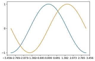
Setting a Locator instead
from matplotlib.ticker import LinearLocator

ax.xaxis.set_major_locator(LinearLocator())

display(fig)
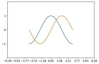
Setting up axis limits
You may need to setup the limits of the Axis.
# plt.xlim(X.min() * 1.1, X.max() * 1.1)
# plt.ylim(C.min() * 1.1, C.max() * 1.1)

ax.set_xlim(X.min() * 2, X.max() * 2)
ax.set_ylim(C.min() * 2, C.max() * 2)

display(fig)
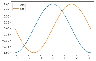
Adding a legend
You can easily add a legend to your plot by setting a label for each sub-plot and calling the .legend() method.
fig, ax = plt.subplots()

ax.plot(X, C, label="cos")
ax.plot(X, S, label="sin")

ax.legend(loc='best')
# fig.legend()

# plt.plot(X, C, label="cos")
# plt.plot(X, S, label="sin")
# plt.legend()

# ax.legend()

display(fig)
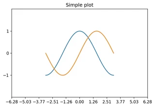
Setting the labels
We can set the Axis labels and Figure title as follows.
# plt.xlabel('x label')
# plt.ylabel('y label')
# plt.title("Simple Plot")

ax.xaxis.set_label('x label')
ax.yaxis.set_label('y label')
ax.set_title("Simple plot")
display(fig)
Plot types
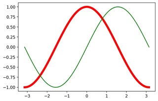
Line plots
Line plot is a type of chart that displays a series of data points called "markers" connected by straight line segments. [Wiki]
The associated method is .plot and it is highly customizable.
For an extensive list of properties, markers and styles, visit the documentation!
As an example, you can configure line color, width and markers.
plt.plot(X, C, linewidth=5, color="red")
plt.plot(X, S, marker="D", markersize=0.1, color="green")
[<matplotlib.lines.Line2D at 0x7f9d99ec2d30>]
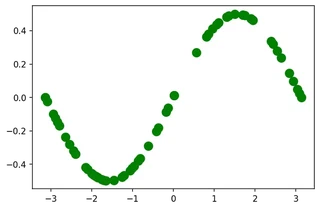
You can also plot only the markers.
indices = np.random.choice(list(range(X.shape[0])), size=64)
plt.plot(X[indices], (S/2)[indices], marker="o", linewidth=0, color="green", markersize=10)
[<matplotlib.lines.Line2D at 0x7f9d99b316d8>]
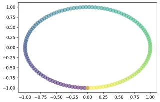
Scatter plots
A scatter plot is a type of plot that displays values as markers.
Scatter plots are often used to display two (or more) variables encoded as x and y coordinates, but also as color and size of the markers.
This kind of plot is used to visually inspect the data and find, for instance, relations between the variables.
You can create scatter plots in matplotlib with the .scatter method.
plt.scatter(np.random.rand(1, 20), np.random.rand(1, 20))
plt.scatter(np.random.rand(1, 20), np.random.rand(1, 20))
<matplotlib.collections.PathCollection at 0x7f9d99b0fda0>
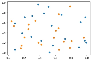
This kind of plot is highly customizable.
plt.scatter(S, C, s=75, c=X, alpha=.5)
<matplotlib.collections.PathCollection at 0x7f9d9a027a90>
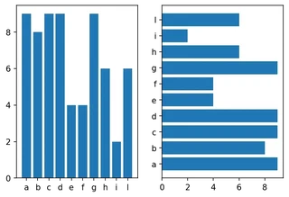
Barplots
Barplots represent categorical data with rectangular bars.
They can be plotted vertically or horizontally and the height (or length) of each bar depends on the values.
Barplots and horizontal barplots can be created with the .bar and .barh methods respectively.
teams = list("abcdefghil")
match1 = np.random.randint(1, 10, size=10)

fig, ax = plt.subplots(1, 2)

ax[0].bar(teams, match1)
ax[1].barh(teams, match1)
<BarContainer object of 10 artists>
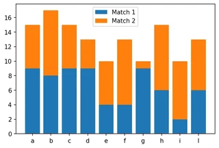
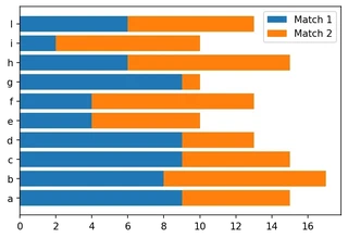
Stacked barplots
Stacked barplots are barplots that stack multiple values of the same category together.
The height (or length!) of the resulting bar shows the combined result.
Vertical stacked barplots
You just use the .bar method and provide the sum of the previous groups as the bottom (offset) parameter.
match2 = np.random.randint(1, 10, size=10)

p1 = plt.bar(teams, match1, label="Match 1")
p2 = plt.bar(teams, match2, label="Match 2", bottom=match1)

plt.legend()
<matplotlib.legend.Legend at 0x7f9d99ca26d8>
Horizontal stacked barplots
You just use the .barh method and provide the sum of the previous groups as the left (offset) parameter.
p1 = plt.barh(teams, match1, label="Match 1")
p2 = plt.barh(teams, match2, label="Match 2", left=match1)

plt.legend()
<matplotlib.legend.Legend at 0x7f9d98231588>
Seaborn
Seaborn is a library for making statistical graphics in Python.
It has built-in functions to show relationships between variables and to visualize univariate and bivariate distributions and it also provides estimators and linear regression models.
It has advanced support for categorical data.
Seaborn comes nice built-in themes to improve your plots and with better default colors that are studied to improve readability from users. It also has advanced functions to simplify the construction of the plot (e.g., grids, legends).
Seaborn is built on top of matplotlib and is closely integrated with pandas.
Import convention
Seaborn is conventionally imported as sns.
import seaborn as sns
Themes
Seaborn comes with nice themes that affect even your matplotlib plots. The default can be set with
.set_theme(context=‘notebook’, style=‘darkgrid’, palette=‘deep’, font=‘sans-serif’, font_scale=1, …)
The context parameter affects the scale elements of the figure and is meant to switch to different contexts (paper, poster, etc) easily.
The style parameter affects some aesthetic elements like colors of the axes and of the grid.
The palette parameter affects the color palette.
The other parameters are self-explanatory.
You can also set the parameters above individually.
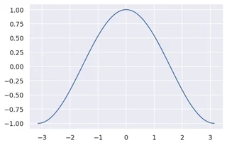
sns.set_theme()
# sns.reset_orig()
plt.plot(X, C, label="cos")
[<matplotlib.lines.Line2D at 0x7f9d904aa550>]
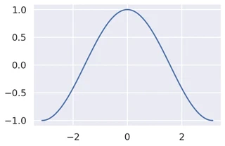
Context
You can set the style using the .set_context() function.
sns.set_context("poster")
sns.set_context("paper")
sns.set_context("talk")
plt.plot(X, C, label="cos")
[<matplotlib.lines.Line2D at 0x7f9d9040c240>]
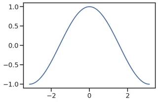
Styles
You can set the style using the .set_style() function.
# sns.set_style("white")
# sns.set_style("whitegrid")
sns.set_style("dark")
sns.set_style("darkgrid")
sns.set_style("ticks")
plt.plot(X, C, label="cos")
[<matplotlib.lines.Line2D at 0x7f9d903d3828>]
Color palette
You can set the style using the .set_palette() function (and visualize them with .color_palette().
# sns.set_palette("flare")
# sns.set_palette("pastel")
# sns.set_palette("dark")
sns.set_palette("Dark2")
plt.plot(X, C, label="cos")
[<matplotlib.lines.Line2D at 0x7f9d903a9550>]
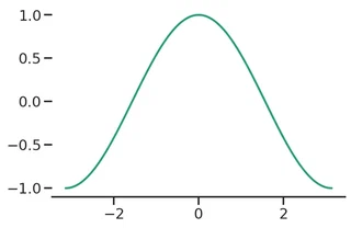
Removing the spines
You can also remove the spines (axis) using .despine().
plt.plot(X, C, label="cos")

sns.despine(left=True, top=True)
plt.rcParams['figure.figsize'] = [6, 4]
plt.rcParams['figure.dpi'] = 150
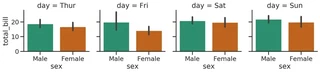
Structured multi-plot grids: FacetGrid
When visualizing data, you may need to plot multiple instances of the same plot on different subsets of your dataset.
For this purpose, seaborn provides FacetGrids, which are basically grids of Axes.
FacetGrid can have up to three dimensions: row, col and hue.
We will not discuss how to create FacetGrids manually as many functions automatically create them.
# Datasets: _seaborn_ has some built in datasets for testing
tips = sns.load_dataset("tips")

tips.head()
| total_bill | tip | sex | smoker | day | time | size | |
|---|---|---|---|---|---|---|---|
| 0 | 16.99 | 1.01 | Female | No | Sun | Dinner | 2 |
| 1 | 10.34 | 1.66 | Male | No | Sun | Dinner | 3 |
| 2 | 21.01 | 3.50 | Male | No | Sun | Dinner | 3 |
| 3 | 23.68 | 3.31 | Male | No | Sun | Dinner | 2 |
| 4 | 24.59 | 3.61 | Female | No | Sun | Dinner | 4 |
# Example of manual creation
g = sns.FacetGrid(tips, col="day", hue="sex")
g.map(sns.barplot, "sex", "total_bill", order=["Male", "Female"])
<seaborn.axisgrid.FacetGrid at 0x7f9d90323860>
Plotting with seaborn
Seaborn has a number of very versatile plotting functions.
We will only focus on a few that work as a “wrapper” for the basic ones.
Another nice thing is that it can create multiple Axes automagically through FacetGrid, depending on the rows and columns parameters that correspond to the columns of your DataFrame.
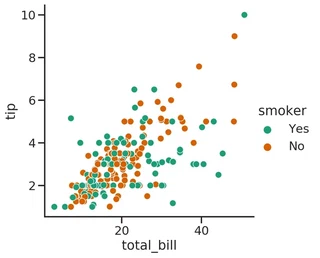
Relations
How can we plot relations with seaborn?
The relplot() function provides access to several different axes-level functions that show the relationship between two variables with semantic mappings of subsets.
seaborn.relplot(data=None, x=None, y=None, hue=None, size=None, style=None, row=None, col=None, palette=None, sizes=None, markers=None, dashes=None, legend=‘auto’, kind=‘scatter’, …)
The kind parameter selects the underlying axes-level function to use:
- scatterplot() (with kind=“scatter”; the default)
- lineplot() (with kind=“line”)
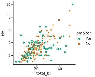
sns.relplot(x="total_bill", y="tip", hue="smoker", data=tips)
# hue_order=["No", "Yes"],
<seaborn.axisgrid.FacetGrid at 0x7f9d902fb668>
sns.relplot(x="total_bill", y="tip", hue="smoker", style="smoker", data=tips);
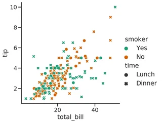
sns.relplot(x="total_bill", y="tip", hue="smoker", style="time", data=tips);
Distributions
Distributions can be plotted with .distplot()
seaborn.displot(data=None, x=None, y=None, hue=None, row=None, col=None, weights=None, kind=‘hist’, rug=False, log_scale=None, legend=True, palette=None, color=None, …)
It can plot histograms, kernel density estimates (KDE) or empirical (cumulative) distribution function (ECDF). The KDE and rug plot (showing the individual observations) can also be added to the plot.
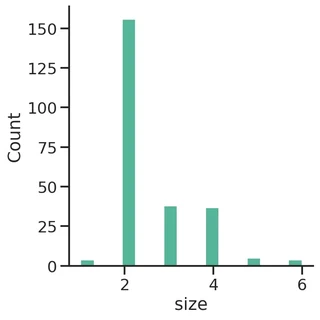
sns.displot(tips, x="size")
<seaborn.axisgrid.FacetGrid at 0x7f9d8fe694a8>
penguins = sns.load_dataset("penguins")

display(penguins.head())
| species | island | bill_length_mm | bill_depth_mm | flipper_length_mm | body_mass_g | sex | |
|---|---|---|---|---|---|---|---|
| 0 | Adelie | Torgersen | 39.1 | 18.7 | 181.0 | 3750.0 | Male |
| 1 | Adelie | Torgersen | 39.5 | 17.4 | 186.0 | 3800.0 | Female |
| 2 | Adelie | Torgersen | 40.3 | 18.0 | 195.0 | 3250.0 | Female |
| 3 | Adelie | Torgersen | NaN | NaN | NaN | NaN | NaN |
| 4 | Adelie | Torgersen | 36.7 | 19.3 | 193.0 | 3450.0 | Female |
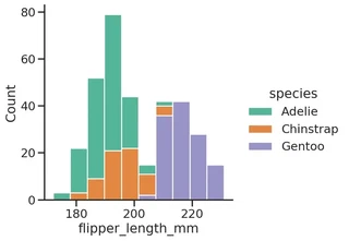
sns.displot(data=penguins, x="flipper_length_mm", hue="species", multiple="stack")
<seaborn.axisgrid.FacetGrid at 0x7f9d8e12beb8>
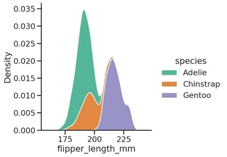
sns.displot(data=penguins, x="flipper_length_mm", hue="species", multiple="stack", kind="kde")
<seaborn.axisgrid.FacetGrid at 0x7f9d8de6f898>
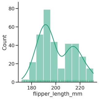
sns.displot(data=penguins, kind='hist', x="flipper_length_mm", kde=True, rug=True)
# sns.displot(data=penguins, kind='kde', x="flipper_length_mm", rug=True)
<seaborn.axisgrid.FacetGrid at 0x7f9d8d288860>
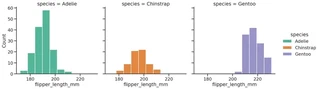
sns.displot(data=penguins, x="flipper_length_mm", hue="species", col="species")
<seaborn.axisgrid.FacetGrid at 0x7f9d8cd39518>
Catplot
The catplot function provides several functions that show the relationship between a numerical and one or more categorical variables.
seaborn.catplot(data=None, x=None, y=None, hue=None, data=None, row=None, col=None, col_wrap=None, estimator=<function mean at 0x7fa4c4f67940>, ci=95, n_boot=1000, units=None, kind=‘strip’, …)
The kind parameter selects the underlying axes-level function to use. There are categorical:
- scatterplots (stripplot with kind=“strip”, swarmplot with kind=“swarm”)
- distribution plots (boxplot with kind=“box”, violinplot with kind=“violin”, boxenplot with kind=“boxen”)
- estimate plots (pointplot with kind=“point”, barplot with kind=“bar”, countplot with kind=“count”)
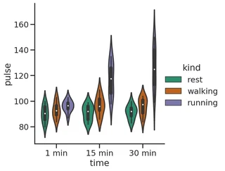
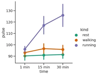
exercise = sns.load_dataset("exercise")
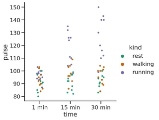
g = sns.catplot(x="time", y="pulse", hue="kind", data=exercise)
g = sns.catplot(x="time", y="pulse", hue="kind", data=exercise, kind="violin")
g = sns.catplot(x="time", y="pulse", hue="kind", data=exercise, kind="point")
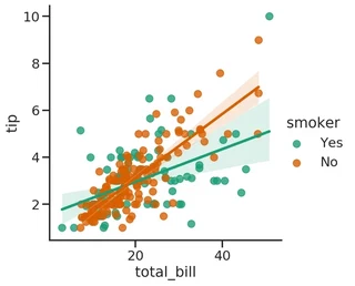
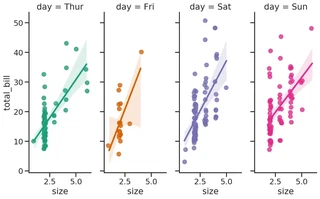
Regressions
lmplot provides an easy way to fit regression models and plot the.
It is intended as a convenient interface to fit regression models across conditional subsets of a dataset.
seaborn.lmplot(*, x=None, y=None, data=None, hue=None, col=None, row=None, palette=None, col_wrap=None, x_estimator=None, x_bins=None, x_ci=‘ci’, scatter=True, fit_reg=True, ci=95, n_boot=1000, units=None, seed=None, order=1, logistic=False, lowess=False, robust=False, logx=False, x_partial=None, y_partial=None, truncate=True, x_jitter=None, y_jitter=None, scatter_kws=None, line_kws=None, size=None)
g = sns.lmplot(x="total_bill", y="tip", hue="smoker", data=tips)
g = sns.lmplot(x="size", y="total_bill", hue="day", col="day", data=tips, height=6, aspect=.4, x_jitter=.1)
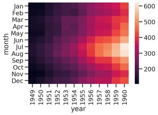
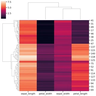
Heatmap and clustermap
Heatmap is a data visualization technique that shows magnitude of a phenomenon as color in two dimensions. [Wiki]
The color may vary in hue or intensity and, if the rows and columns may be reordered to find clusters in the data, the plot is called clustered heatmap.
flights = sns.load_dataset("flights")
flights = flights.pivot("month", "year", "passengers")

sns.heatmap(flights)
<matplotlib.axes._subplots.AxesSubplot at 0x7f9d8f2d6080>
iris = sns.load_dataset("iris")

species = iris.pop("species")

g = sns.clustermap(iris)
Exercise
Given the CSV file from the previous lecture, load it and perform some statistical analysis.
Load the CSV file.
import pandas as pd

file = "albumlist.csv"

df = pd.read_csv(file,
                 encoding="ISO-8859-15",
                 index_col="Number"
                )

display(df.head())
| Year | Album | Artist | Genre | Subgenre | |
|---|---|---|---|---|---|
| Number | |||||
| 1 | 1967 | Sgt. Pepper's Lonely Hearts Club Band | The Beatles | Rock | Rock & Roll, Psychedelic Rock |
| 2 | 1966 | Pet Sounds | The Beach Boys | Rock | Pop Rock, Psychedelic Rock |
| 3 | 1966 | Revolver | The Beatles | Rock | Psychedelic Rock, Pop Rock |
| 4 | 1965 | Highway 61 Revisited | Bob Dylan | Rock | Folk Rock, Blues Rock |
| 5 | 1965 | Rubber Soul | The Beatles | Rock, Pop | Pop Rock |
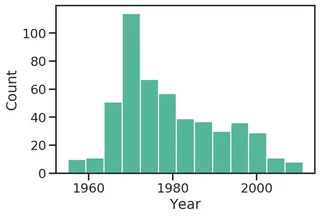
Plot the histogram of the number of albums in the cart for each year.
sns.histplot(data=df, x="Year")
<matplotlib.axes._subplots.AxesSubplot at 0x7f9d719cd048>
Show the unique values of the Genre column.
df["Genre"].unique()
[Rock, Rock, Pop, Funk / Soul, Rock, Blues, Jazz, ..., Electronic, Funk / Soul, Rock, Funk / Soul, Blues, Rock,ÊPop, Electronic, Rock, Funk / Soul, Blues, Pop, Rock, Reggae, Latin]
Length: 63
Categories (63, object): [Rock, Rock, Pop, Funk / Soul, Rock, Blues, ..., Rock, Funk / Soul, Blues, Rock,ÊPop, Electronic, Rock, Funk / Soul, Blues, Pop, Rock, Reggae, Latin]
Since there are a bit too many sub-genres for each row, keep just the first one.
df["MainGenre"] = df["Genre"].apply(lambda x: x.strip().split(",")[0].strip())
df["MainGenre"].unique()
array(['Rock', 'Funk / Soul', 'Jazz', 'Blues', 'Pop', 'Folk', 'Classical',
       'Reggae', 'Hip Hop', 'Electronic', 'Latin'], dtype=object)
Set the Genre as categorical variable.
df["Genre"] = df["Genre"].astype("category")
df["MainGenre"] = df["MainGenre"].astype("category")

display(df["MainGenre"].unique())
[Rock, Funk / Soul, Jazz, Blues, Pop, ..., Classical, Reggae, Hip Hop, Electronic, Latin]
Length: 11
Categories (11, object): [Rock, Funk / Soul, Jazz, Blues, ..., Reggae, Hip Hop, Electronic, Latin]
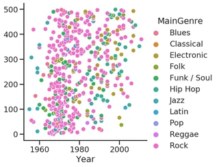
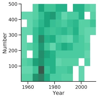
Now let’s plot a scatterplot of the position (Number, used as index) as function of the Year. As a third variable, we are also interested in the main genre of the album.
sns.relplot(kind="scatter", data=df, x="Year", y=df["Year"].index, hue="MainGenre")
<seaborn.axisgrid.FacetGrid at 0x7f9d71126630>
sns.displot(df, x="Year", y="Number", kind="hist")
<seaborn.axisgrid.FacetGrid at 0x7f9d71160320>
Reset the index to restore the Number column.
df.reset_index(drop=False, inplace=True)
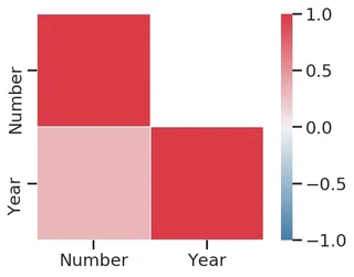
And compute the correlation between the Number and Year columns.
corr = df[["Number", "Year"]].corr()

display(corr)
| Number | Year | |
|---|---|---|
| Number | 1.000000 | 0.325667 |
| Year | 0.325667 | 1.000000 |
What about showing the correlation via a plot?
sns.heatmap(corr, center=0, vmin=-1, vmax=1, square=True, linewidths=.5)
<matplotlib.axes._subplots.AxesSubplot at 0x7f9d71047e10>
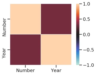
The heatmap above shows the correlation between the two variables.
Yet, we don’t like the colors and we know the matrix is symmetrical, so we would like to show only the lower triangle.
Let’s try to improve the plot.
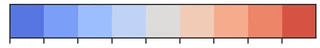
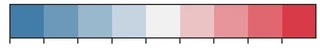
What about the color palette?
While matplotlib has many palettes, not all of them are actually good for visualization.
Seaborn tries to overcome this limitation by providing a nice interface for the HSLuv (formerly known as HUSL) color system, which works better with human vision as it minimizes the variation of intensity of colors.
# Built in in matplotlib
sns.palplot(sns.color_palette("coolwarm", n_colors=9))
# HUSL system palette
sns.palplot(sns.diverging_palette(240, 10, n=9))
# Generate a custom diverging colormap
cmap = sns.diverging_palette(240, 10, as_cmap=True)
# cmap = sns.color_palette("coolwarm", as_cmap=True)
Let’s generate a mask to filter out some values from the plot.
We are interested in displaying just the lower (or the upper) triangle of the matrix.
# Generate a mask for the upper triangle, excluding the diagonal
mask = np.triu(
    np.ones_like(corr, dtype=bool),
    k=1
)
display(mask)
array([[False,  True],
       [False, False]])
sns.heatmap(corr, cmap=cmap, mask=mask, center=0, vmin=-1, vmax=1, square=True, linewidths=.5)
<matplotlib.axes._subplots.AxesSubplot at 0x7f9d7185e7f0>
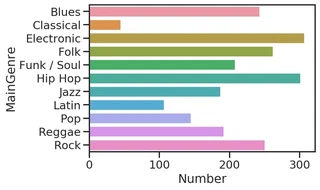
At this point we want to group the DataFrame by the main genre to compute the average position in the chart.
grouped_by_genre = df.groupby("MainGenre")
mean_position = grouped_by_genre["Number"].mean()
mean_position = mean_position.round(2)

display(mean_position)
MainGenre
Blues          243.22
Classical       45.00
Electronic     307.13
Folk           262.23
Funk / Soul    208.08
Hip Hop        301.41
Jazz           187.42
Latin          107.00
Pop            145.00
Reggae         191.86
Rock           250.39
Name: Number, dtype: float64
sns.barplot(x=mean_position, y=mean_position.index)
<matplotlib.axes._subplots.AxesSubplot at 0x7f9d70ef2a58>